Creative design for a unique escape experience
Destination Escape
Destination Escape is an interactive travel experience that leads users to unique locations across Switzerland and is framed as part of an exciting escape-style series. We created a consistent visual identity for the project from the logo and print materials to the website. Our design and structure make curiosity, atmosphere and clarity tangible across all touchpoints.
A bold visual identity for Destination Escape
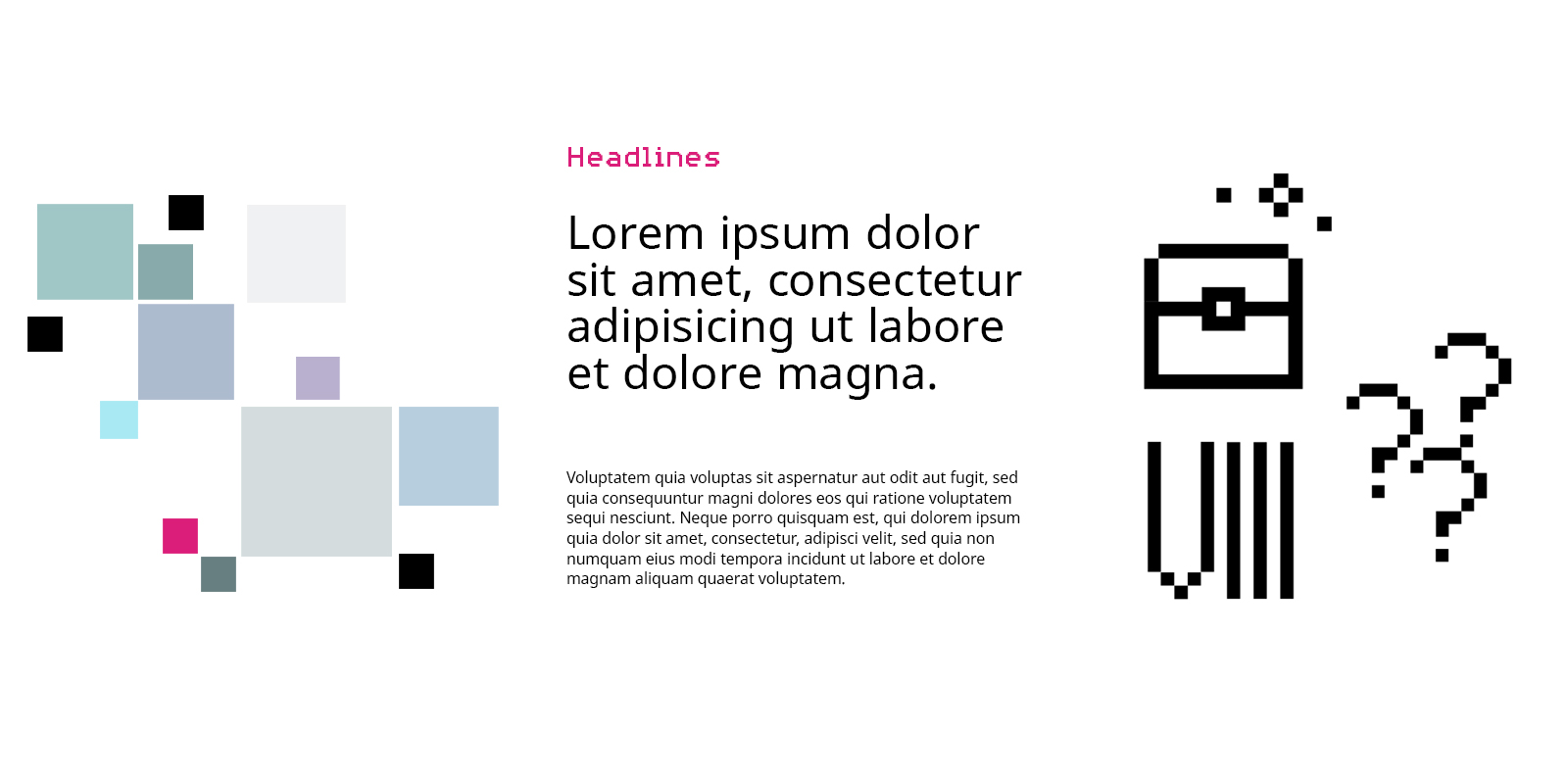
Strong colors and clean typography define the look of Destination Escape. A distinctive feature is the combination of two design worlds: pixelated icons reminiscent of digital escape games and finely vectorized icons that ensure clarity and precision. The typography conveys a modern, slightly mysterious atmosphere, perfectly complementing the overall visual concept.


Custom illustrations & icons for unique destinations
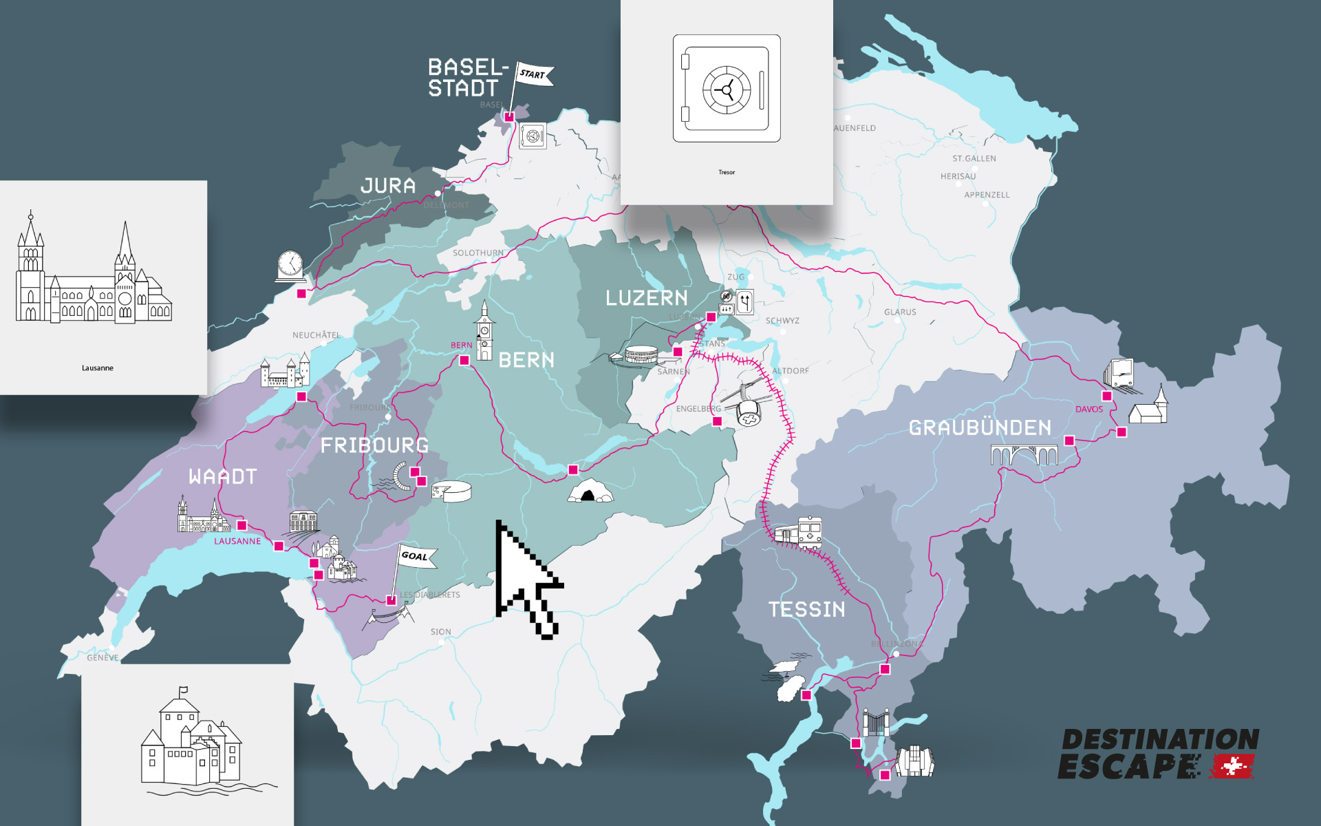
We created tailored icons for Destination Escape that visually represent landmarks and highlights of the different travel locations. This results in a clear, recognizable style that playfully conveys the diversity of the destinations.
Interactive map intuitive and informative
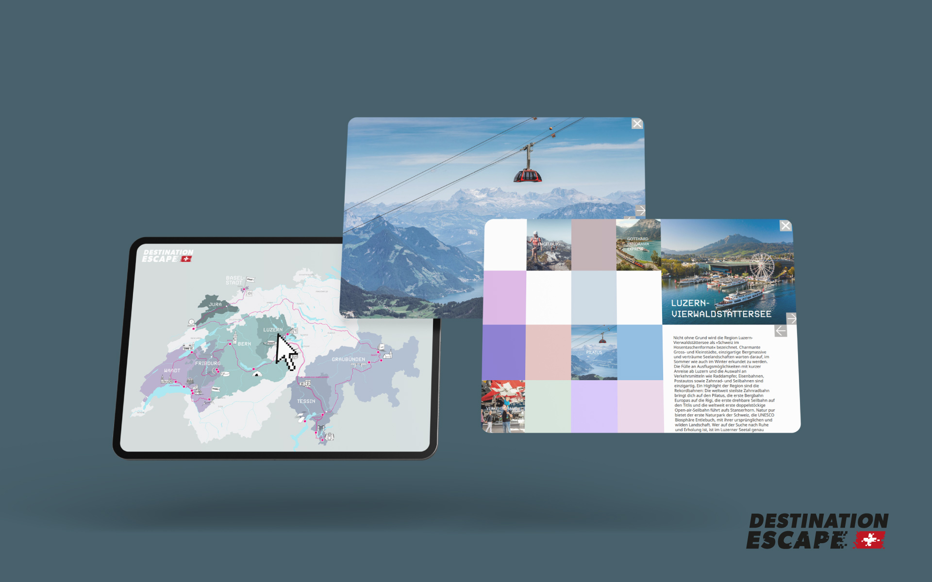
The interactive map is a central feature of the website allowing users to explore the travel destinations in a playful yet clear way. It combines visual details with useful information supporting navigation through the escape series.
Shifting letters, steady message
The typographic module echoes the logic of the escape series. Just like in the puzzles, users decode shifting letters on the website until a clear message appears. Design and content interact playfully and purposefully.
Website as an experience space
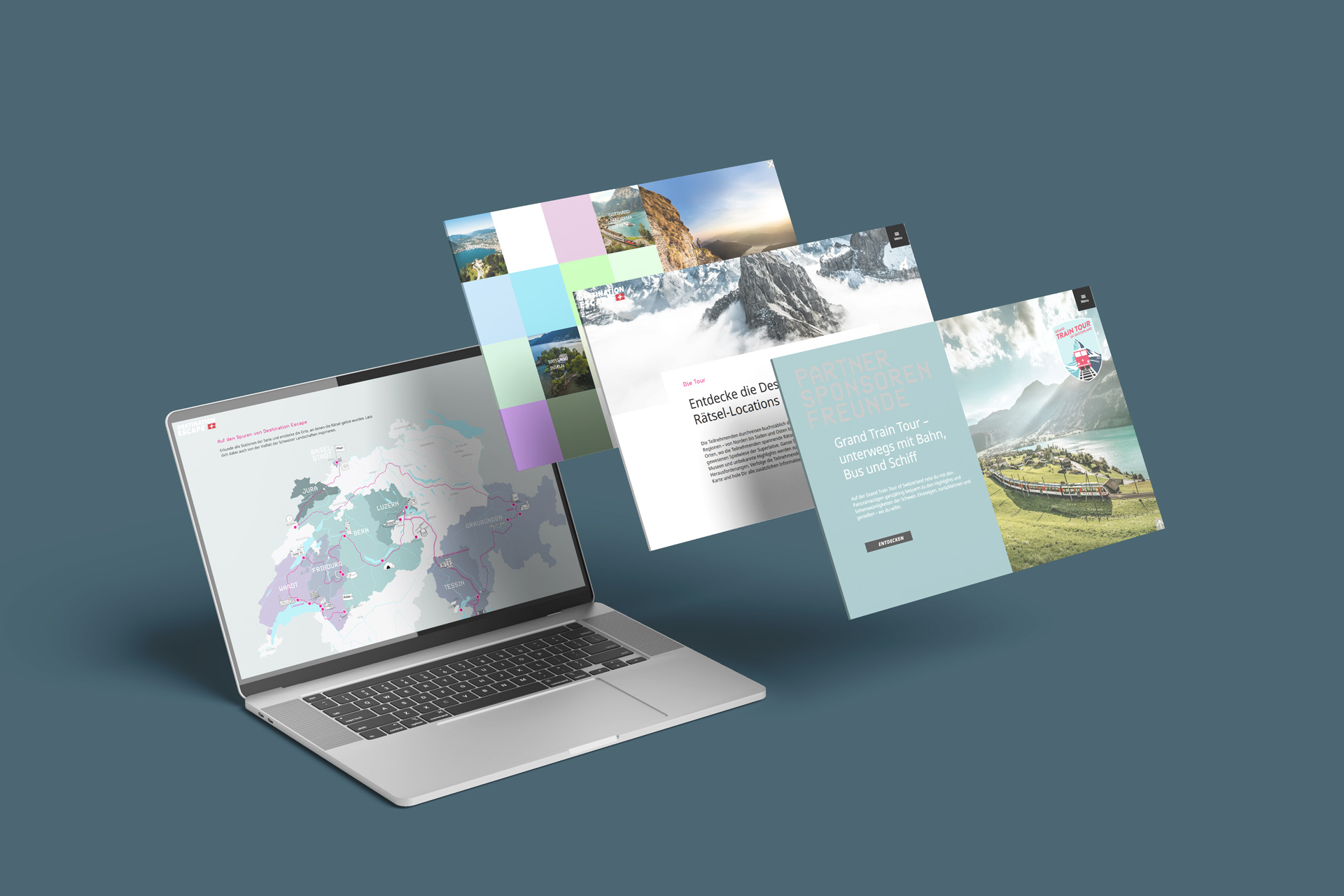
The website combines storytelling, interaction and clean design into a cohesive whole. Users are guided intuitively through the project while visual details and micro animations bring the tension of the escape series into the digital space. Dynamically generated pixels in changing colors and positions offer a new visual experience with each page load and reflect the playful logic of the concept.
Posters as visual entry points
The posters bring the atmosphere of Destination Escape into public space. With bold colors, clear messaging and the signature pixel aesthetic, they spark curiosity and offer a first glimpse into the world of the series.


Are you looking for outstanding branding & content that sets you apart?
Let's talk about your project.